Welcome to "Android Super Nerds". Thanks for coming back to my site, I really appreciate that and if you guys are new to my Site please do check my previous articles as well.
Nowadays, any application we consider .i.e. web or mobile, notifying our user about warning, information, new notification message, error, or any status related to any crucial action message via an Alert Box or more alike a DialogBox is a best practice.
Alert Dialog Box

An alert dialog box is a medium to display and prompt an important message to our user. Even the action button can be seen on it, which seeks the user to make his decision.
A dialog box can be a simple approach for message sharing to our user but it too can vary depending on its already defined classes and method.
Its class already have defined methods and attribute field given below🠗
Most of the Apps have different requirements for dialog box appearance and action button handler. So the custom feature is only the solution. Custom Dialog Box can be implemented on the existing Activity, fragment, or some generic calls like🠗
Inside a method of the class
Yes & No button dialog - Let's start with something simple, like yes & no option alert dialog. And for doing that we need to create an instance of DialogInterface.OnClickListener class. This instance handles the click event for both positive and negative button. Something like this🠗
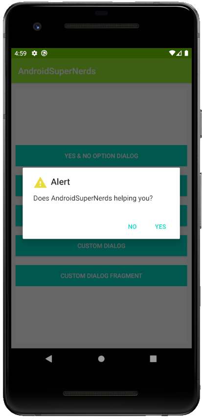
Ok & Cancel button dialog - Same approach can be used for ok & cancel option alert dialog but not required any instance of DailogInterface. Code will be something like this🠗

Ok button dialog - Same as previous code approach but not required a negative button. And Code will be something like this🠗

Custom Layout Dialog - For inflating the layout on the dialog view, first it is required to create a layout that needed to be displayed on the dialog view once it is prompted. And for doing that we need to use LayoutInflater instance, which also require the view id identification for initializing the view and its click event. Code can be seen this🠗

Custom dialog box implementation via Dialog Fragment
The code for displaying this dialog, differs from other code which we show earlier.🠗

If you guys are still on my page, then thanks for staying on it and I really appreciate that.
And
Happy Coding...😃
Update (September 2026): alert dialogs with Material 3 and Jetpack Compose
The examples above use the old AlertDialog.Builder. It still works, but new projects should use the Material 3 dialogs, which follow your app theme (shapes, colors, typography) automatically. Here are the modern equivalents.
1. Simple confirmation dialog (Material 3, Kotlin)
Add the Material Components dependency (com.google.android.material:material) and make sure your app theme extends Theme.Material3.*. Then use MaterialAlertDialogBuilder:
MaterialAlertDialogBuilder(this)
    .setTitle("Delete item?")
    .setMessage("This action cannot be undone.")
    .setNegativeButton("Cancel") { dialog, _ -> dialog.dismiss() }
    .setPositiveButton("Delete") { _, _ ->
        // handle delete
    }
    .show()
2. Custom layout inside the dialog (View Binding)
Instead of LayoutInflater.from(...).inflate(...) with findViewById, use view binding:
val binding = DialogCustomBinding.inflate(layoutInflater)

val dialog = MaterialAlertDialogBuilder(this)
    .setView(binding.root)
    .setPositiveButton("Save") { _, _ ->
        val name = binding.nameInput.text.toString()
        // use name
    }
    .setNegativeButton("Cancel", null)
    .create()

dialog.show()
3. DialogFragment (survives rotation)
A plain dialog is dismissed when the activity is recreated. If the dialog must survive configuration changes, wrap it in a DialogFragment:
class ConfirmDialogFragment : DialogFragment() {

    override fun onCreateDialog(savedInstanceState: Bundle?): Dialog {
        return MaterialAlertDialogBuilder(requireContext())
            .setTitle("Leave this screen?")
            .setMessage("Unsaved changes will be lost.")
            .setNegativeButton("Stay", null)
            .setPositiveButton("Leave") { _, _ ->
                requireActivity().finish()
            }
            .create()
    }
}

// show it
ConfirmDialogFragment().show(supportFragmentManager, "confirm")
4. Jetpack Compose version
In Compose a dialog is just a composable that you show while a state flag is true:
@Composable
fun DeleteDialogDemo() {
    var showDialog by remember { mutableStateOf(false) }

    Button(onClick = { showDialog = true }) {
        Text("Delete item")
    }

    if (showDialog) {
        AlertDialog(
            onDismissRequest = { showDialog = false },
            title = { Text("Delete item?") },
            text = { Text("This action cannot be undone.") },
            confirmButton = {
                TextButton(onClick = {
                    showDialog = false
                    // handle delete
                }) { Text("Delete") }
            },
            dismissButton = {
                TextButton(onClick = { showDialog = false }) { Text("Cancel") }
            }
        )
    }
}
Because the dialog is driven by state (showDialog), it is automatically restored when you use rememberSaveable instead of remember, so you do not need a DialogFragment in Compose.
Which one should you use?
- XML/View app:
MaterialAlertDialogBuilder, plus aDialogFragmentwhen the dialog must survive rotation. - Compose app:
AlertDialogcontrolled by a state variable. - Old code:
AlertDialog.Builderkeeps working, but it will not pick up Material 3 styling.
Comments
Post a Comment