Today we are going to see what are the possible ways of using Custom Toast.
Note: Basically toast is kind of that component which just pops up with some information(message) and disappears. And believe me, we really need this kind of alert feature most of the time.

But again a question arises why do we really require customized toast?
Here the answer is really simple. Just look at it.

So are you impressed?. I guess "NOT".😏😏😏😏
but now suppose just think once, if some custom layout is displayed here inside the toast, and we really didn't need to do anything with its default functionality it gonna be super cool.
 |
| Got it Right 😉😉😉😉 |
So let's see how to make it happen.
First, create a layout which you desire to display inside toast view. Something like this ↓
Here we have just added one ImageView with TextView.
Now create an Activity Class and add its layout, I had just created one with a simple layout with two sets of a button with its clickable features. ↓
For displaying this Custom Toast, I had created a method which is going to be invoked via button's click functionality. ↓
And in the end, Custom Toast is gonna look like this ↓
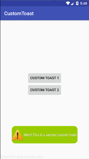
Here again, I had created and added background gradient XML file with Rounder Curve (please check out my Old Post on Rounder Curve via here).
Another alternative way of creating Custom Toast is by playing with its own class instance(object).
And for displaying this Custom Toast using its Class instance, I had created another method which is again going to be invoked via button's click functionality. ↓
Here the method, setCompoundDrawablesWithIntrinsicBounds is used for aligning Image Icon.
This method had four parameters.
The first Parameter is for aligning icon to the left of TextView.
The second Parameter is for aligning the icon to the top of TextView.
The third Parameter is for aligning icon to the right of TextView.
Forth Parameter is for aligning icon to the bottom of TextView.
The outcome from this method ↓

Final full Code for Custom Toast Activity ↓
After adding the above-given code in your Activity Class. the final outcome would be ↓

What have we covered today?
- Creating the Custom Toast is possible via inflating the android layout.
- Without inflating the android layout also we can add icon inside the Toast View.
- Using method "setCompoundDrawablesWithIntrinsicBounds", image icon can be aligned anywhere inside the toast view.

If you have any questions about Custom Toast or any of the UI components, Please do Leave a comment below..!!
&&
If you like this article don’t forget to share it.
Till then "Happy coding".
Update (September 2026): custom toasts are deprecated, use a Snackbar instead
Custom toast layouts still work in many cases, but Android has been limiting them for years:
Toast.setView()is deprecated since Android 11 (API 30).- On Android 11 and higher, custom toast views are not shown while your app is in the background.
- If you target API 30 or higher,
setGravity()andsetMargin()have no effect on text toasts.
For messages that need custom styling or an action button, the recommended replacement is a Snackbar. It lives inside your own UI, so it follows your theme, can be styled freely and can carry an action such as "Undo".
1. XML/View apps: Material Snackbar
Snackbar.make(binding.root, "Profile saved", Snackbar.LENGTH_LONG)
    .setAction("UNDO") {
        // undo the change
    }
    .setBackgroundTint(Color.parseColor("#6650A4"))
    .setTextColor(Color.WHITE)
    .setActionTextColor(Color.YELLOW)
    .show()
Pass a view that is inside a CoordinatorLayout (or the root view) and the Snackbar will slide up from the bottom of the screen and even move a FloatingActionButton out of the way.
2. Jetpack Compose: SnackbarHost
In Compose, the Snackbar is shown through a SnackbarHostState that you attach to a Scaffold:
@Composable
fun SnackbarDemo() {
    val snackbarHostState = remember { SnackbarHostState() }
    val scope = rememberCoroutineScope()

    Scaffold(
        snackbarHost = { SnackbarHost(hostState = snackbarHostState) }
    ) { padding ->
        Box(
            modifier = Modifier
                .fillMaxSize()
                .padding(padding),
            contentAlignment = Alignment.Center
        ) {
            Button(onClick = {
                scope.launch {
                    val result = snackbarHostState.showSnackbar(
                        message = "Profile saved",
                        actionLabel = "Undo",
                        duration = SnackbarDuration.Short
                    )
                    if (result == SnackbarResult.ActionPerformed) {
                        // undo the change
                    }
                }
            }) {
                Text("Save")
            }
        }
    }
}
3. If you really need a plain toast
For a quick, non-interactive message you can still use the standard text toast, which is fully supported:
Toast.makeText(context, "Saved", Toast.LENGTH_SHORT).show()Just do not rely on custom layouts, gravity or margins for it on newer Android versions.
Which one should you use?
- Short confirmation without an action: a plain text toast is fine.
- Anything with custom styling or an action button: Snackbar (Material for XML,
SnackbarHostin Compose). - Important messages that need a decision: use an alert dialog instead (see the alert dialog post on this blog).
Comments
Post a Comment